 Just off Higgins street here in Missoula we have a great little bar called the Old Post Pub. With a $7 “Beer & Burger Nite” every Monday featuring pints from Big Sky Brewery and hearty third-pound burgers, the “O.P.P” as quickly become a favorite weekly hang-out.
In addition to great beer and fare, the O.P.P has a very warm and friendly atmosphere. A high tin ceiling, original wood paneling and a thoroughly sleeve burnished bar are instant rapport builders with anyone looking for a place with history and character. A chalkboard by the door displays the latest snowpack measurements from the surrounding ski-hills and a stack of magazines sports copies of Bugle, Outdoor life, Outside and Powder. Perhaps most impressively, there is a large board upon which regulars can post pictures of their most recent catches, kills and trophies.
I took some time this week during Beer and Burger Nite to really examine the bragging rights snapshots up for display. There were photos of impressive trophy elk, whale-sized salmon and majestic pronghorn tacked up by the dozens. But I noticed rather quickly how paltry much of the photography was. Often, the prize catch was out of focus, partially out of frame or laying halfway out of the bed of a truck.
Of course, getting meat in the freezer is the first priority and after a long day of patience and hard-work, it’s tough to think of anything else. But if you really want to show off your well earned catch, here is one powerfully simple tip to making sure that your photos will look just as good on the wall of your office or den as they do on the wall of the O.P.P.
The biggest thing to consider is composition. If you’re shooting digitally, there are a lot of things yo can do to brighten or darken a photo even with the basic editing software that came with your camera. But short of cropping, there isn’t much you can do about a badly composed photo.
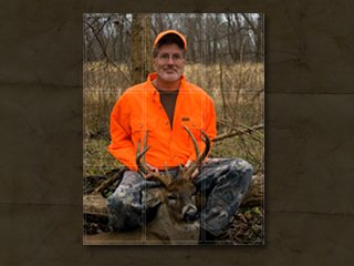
Try using what photographers refer to as “the rule of thirds.” In order to add balance to your image, try to imagine it broken up into 3 horizontal, and three vertical sections that overlap. The scene will dictate how you use these thirds, but try to put a different element of the photo into three sections.
For example, look at the photo I’ve attached of my Dad’s 2009 whitetail kill. Notice the divisions of the frame into thirds across each axis and how the frame is balanced to crate a pleasing portrait. This is a pretty rigid example of the rule. Many times photographers add interest by playing with the “hotspots” of the frame where the axis meet. But for a great and reliable portrait of you and your hunt, either set up the photo yourself with this in mind, or make sure your hunting buddy gets the gist on how to make the shot of your kill wall worthy.
Besides, once you get great at taking photos of your buddies’ bagged game, they’ll be a little more likely to share some choice cuts in exchange for a print. Happy shooting, and shooting!


